Guided Action: Steps to Designing for a Successful First Click
4 min read

Think back to the most challenging math class you’ve taken. Did you ever sit there, stuck, agonizing over a problem for (what seemed like) hours? How often did it turn out, when you went in for help, that your fatal mistake happened at the very beginning? It’s crucial to get the first step right in any multi-step process, whether it’s calculus or putting on a pair of pants.
The same is true when using an application for the first time. A misguided first click jeopardizes a rewarding user experience. Studies conducted by Bailey and Wolfson show a 50% decline in likelihood that a new user will successfully execute a task if their first click is the wrong click. With statistics like that, doesn’t it seem worthwhile to concentrate time, energy, and resources on a focused path for your user? Someone who, like us, deals with major time constraints and has limited cognitive reserves? It does if you want your product to succeed. If you want to enable your user (let’s call her Jane) to navigate effortlessly through your site to reach her goal, make her experience as smooth as possible.
Make your user’s experience like a magic carpet ride. If you leave them struggling on a slow, stubborn camel, they are much more likely to find another mode of transportation.
So how should you design for a successful first click, and avoid users leaving your site behind? Here are three important building blocks to keep in mind throughout your team’s design process.
Step 1: Keep the Why in Front of You
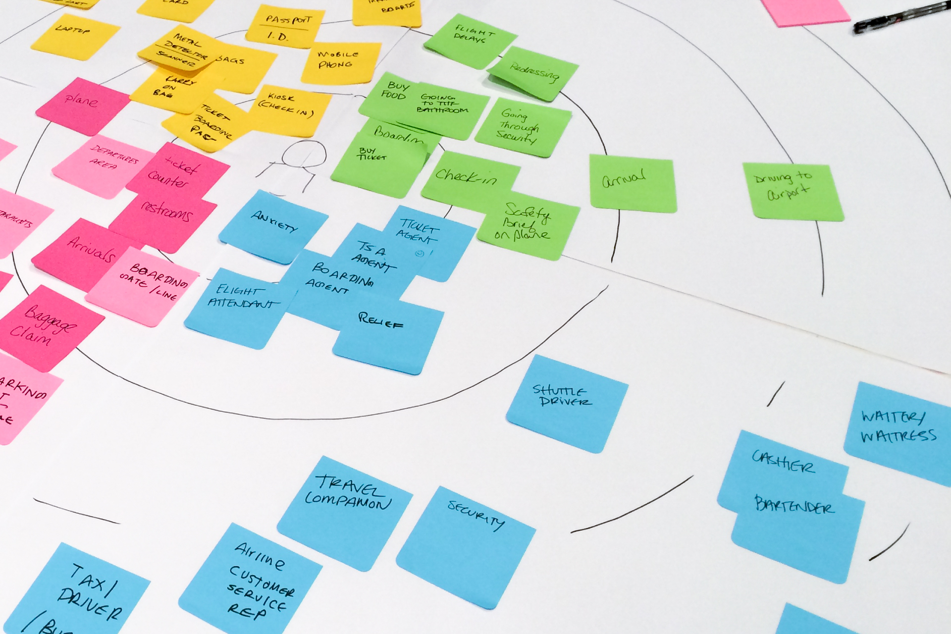
Before you hit the design stage of a project, you should have a comprehensive understanding of what Jane needs through research. Your goal should be to have a clear, holistic understanding of the problem before you make any decisions.
How to find the why:
- Why does Jane need this product? What is her end goal?
- What decisions does she need to make along the way?
- What critical information does she need to know to lead her to each decision?
- What competitors exist and what is missing?
The tricky part is not losing sight of Jane’s needs. Beat yourself over the head with the why… heck, invest in a 40’ banner to hang on your wall spelling out W-H-Y Jane will use your product. Put her picture in a frame and set it on your desk to serve as your daily reminder. Whatever you do, just be sure that you are designing for her. She came with a purpose and is trying to complete a task. As designers, our job is to streamline her process.
Step 2: Cut to the Chase – Eliminate Distraction and Solve for the User
Innovation is commonly a result of someone thinking, “there’s got to be a better way to do this.” “Better” in the mind of a user usually means simplified, but as all UX designers know, it’s hard to make things simple. We have to grasp the critical components of the task at hand and focus on those.
Here’s how we use our research to design for the user:
- Identify what needs to be there to support the “why” (no, you haven’t escaped the why yet).
- Know who you’re designing for (Jane) and what she cares about.
- Focus on 2-3 key pathways, be concise, and enable quick decisions.
- Don’t get caught up in the “what if’s”. What if this guy comes in, who’s different from most of our users, and wants to do this really uncommon thing? We want to design for our main persona, Jane, who we know (through research) will use our product.
Step 3: Translate to a Desirable User Interface
So you’ve got steps 1 & 2 down. Now it’s time to take what you know and convert user intent into UI components.
- Once you know what Jane needs, make sure it’s what she is going to see.
- Giving Jane a framework and consistent components allows her to understand several parts of a system at once.
- Create a logical path. Use a thoroughly-planned hierarchy to point Jane in the right direction.
- Spend time on content. You want to have clear, readable and consistent language across your site to help give Jane guidance.
Let’s do a quick recap: In order to create a great user experience, the user needs to have a clear path to success. By researching user motivation, eliminating distractions, and creating a optimal path through the system, Jane is 87% more likely to complete her task (Bailey and Wolfson, 2009). She is a much happier user, and now she’s inclined to come back.
Jane’s interaction with your site can either be a bumpy ride or smooth sailing. Which will you design for?